
Picture this: You are using your new shiny site to demonstrate all its capabilities to your friend who has an iPhone using Safari, and… the site crashes without warning, no movements, no sound, and deafening silence. Buttons do not click, layout does not crumble, images disappear.
In the meantime, it appears perfect in Chrome on your laptop. Sounds familiar?
We have all been in that situation where the frustrated user clicks away after realizing that your site works well with a particular browser, but it works well with no one.
It is the cross-browser trap that all web developers should look out for, and in web maintenance, you should not look over your shoulder because when it goes wrong, it goes down the drain in terms of traffic, credibility, and income.
It is time to explore the reasons why this is not to be fixed as an option, and why you can ensure that your site runs smoothly across the board.
What is Cross-browser Compatibility?
Cross-browser compatibility refers to your site appearing, behaving, and functioning identically regardless of the browser an individual uses to open your site, be it Chrome, Firefox, Safari, Edge, or whichever other browser they may be using.
It is not only about beautiful graphics, but it is also about making sure that the buttons work, the form is posted, the information is loaded, and it is not glitchy, regardless of the peculiarities of the browser or the differences in its engine.
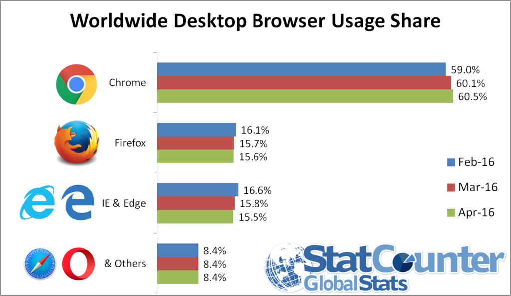
Source: StatCounter
Chrome is the dominant one globally, whereas Safari is the dominant one on Apple Devices as a major reason why sites have to test on both.
Do you remember BBC News redesigned in 2019? Their glitzy CSS animations worked wonders in Chrome but were a pixelated nightmare on Safari – videos would not play, and menus would cross up.
Social media user outbursts decreased traffic by 15 percent, and the team scurried to find a solution.
Simple lesson: Test before you flop, or you are flopping.
The Role of Cross-Browser Compatibility in Website Maintenance
The ability to cross-browse is essential in the maintenance of a site since individuals visit websites with varied browsing systems, devices, and operating systems.
New browsers such as Chrome, Firefox, Safari, and Edge might have a slightly different understanding of the code of websites.
Unless compatibility is checked regularly, some of the elements of the site might look broken, fail to load, or cease to work in some cases.
Hence, most brands opt for an experienced website maintenance service, which keeps checking on their site and correcting the browser-related problems before they can influence the clients.
When being maintained regularly, cross-browser compatibility helps to make sure that a site stays stable, operational, and aesthetically consistent when browsers evolve and web technologies alter.
Although the properly developed site might have small layout or functionality issues that may arise with time, unless it is tested in various browsers.
Continuous maintenance can also be used to detect such problems at an early stage and ensure the site performs its functions well for all users.
Some of the major reasons why cross-browser compatibility is important in the maintenance of a website are:
- Constant design and layout: Makes sure that pages render correctly with all the main browsers without faulty layout or misaligned graphics.
- Fidelity: Ensures that forms, buttons, navigation menu, and other interaction elements are functional on all browsers.
- Enhanced user experience: Visitors can navigate the site without encountering browser-specific errors and usability problems.
- The early identification of technical problems: Routine testing can be used to find out the inconsistency in CSS, JavaScript, or HTML before it turns into more significant concerns.
- Stability over the long term: With the release of updates by browsers, compatibility checks will assist in ensuring that the performance and reliability of the website remain unchanged.
By incorporating cross-browsing in the normal maintenance of the websites, companies can ensure that when a visitor visits their site, there is a well-integrated flow with the same experience, no matter the browser they use.
Common Cross-Browser Compatibility Issues
Your code may be technically perfect, but it rarely looks or behaves the same on any screen. Because various browsers operate on various engines, such as WebKit in Safari and Blink in Chrome, they tend to disagree on how to interpret your instructions into a visual layout.
The most common obstacles during maintenance of a site are as follows:
1. Inconsistent CSS Rendering
CSS tends to break first. The version of the browser available before the current one may not be compatible with advanced layout modules such as CSS Grid or Flexbox.
This causes shifted elements where a sidebar may all of a sudden shift to the bottom of the web page on a particular browser and appear great on another.
The Impact: Based on different industry benchmarks, a layout shift can rise by more than 20 percent when the visual hierarchy is broken.
Real-World Example: You may apply a particular gap property to a flex container, which is working perfectly in Chrome, but a user on an old version of Safari now sees all your buttons crowded together and no spacing at all.
2. JavaScript Engine Discrepancies
JavaScript, the intelligent agent of your site, can not be interpreted the same way by every browser.
Scripts are executed by different engines (V8, SpiderMonkey, etc.) used by different browsers. If you take advantage of contemporary ES6+ capabilities and lack a safety net, your site will have its interactive means – pop-ups, form validation, or sliders – frozen.
The Statistic: JavaScript is turned off by approximately 0.2 to 2 percent of the world’s users, or use browsers that do not perform well with heavy scripts, which is not very large until you consider that it is a number of millions of potential customers.
The Scenario: A customer hits your “Add to Cart” button using an older mobile browser, but it fails to work due to an error in a script. Not even a loading spinner, not even an error message, a dead button.
3. Non-Standard Font and Typography Processing
Typography is highly capricious. Anti-aliasing (smoothing) fonts in browsers are in a variety of forms.
After that, when your browser fails to retrieve your custom Google Font, if you have not specified appropriate fallbacks, it will fall back to a default system font, such as Times New Roman, which will ruin your high-end look.
Pro Tip: You should always apply the font-display: swap; property to stay visible until your custom font is loaded.
4. Image Format & Video Support
Although WebP and AVIF are the best standards of high-performance images at the moment, they do not exist in every single legacy browser.
The Data: With the help of such modern formats as WebP, the file sizes can decrease by almost 2534 percent in comparison to JPEG; however, when the file is not recognized by the browser, a broken image icon will appear.
Example: When your hero background is a high-res WebP image, an unoptimized fallback could render your homepage a blank white box to a user with a less-modern device.
How Different Browsers Interpret Website Code
In order to comprehend why a site appears off on another device, you need to consider a browser as a translator.
The HTML, CSS, and JavaScript are the original text, but each browser, such as Chrome, Safari, or Firefox, has its own Rendering Engine to interpret the text.
The translation will not be perfect in case the engine is old, or is slightly different in conformity with its regulations.
The Translators: Behind the Screen
- The Engines: Chrome and Edge feature Blink, Safari features WebKit, and Firefox features Gecko. Although all of them strive for the same standards, they do not necessarily introduce new features simultaneously.
- The Parsing Process: Your HTML is first compiled into a DOM (Document Object Model) by the browser, and then the CSSOM (CSS Object Model) is added to it. When a browser does not identify a particular CSS property, it does not cause an error; it simply skips it, and in many cases, this renders your layout unusable.
- JavaScript Execution: During the drawing of the layout, the interactive logic is executed by the JavaScript Engine (such as V8 or SpiderMonkey). In case the code contains a current “shortcut” that the engine has not yet learnt, the code fails, and your buttons or forms cease to operate.
- Speed Gap: There is a difference in the activities of different engines. A person could make the text practically instantly and have problems with complicated animations, whereas another could be a load lifter, loading it all once at a time, but requiring a long time to get the initial pixel on the screen.
Best Practices for Maintaining Cross-Browser Compatibility
Being able to maintain a site in various browsers does not necessarily need to be a game of guesses.
With a couple of set rules, you can make sure that your layout will remain intact even when a visitor runs on a high-end desktop or an older smartphone.
1. Use a CSS Reset or Normalize.css
Margins, padding, and headings have their default styles in browsers, and this causes uneven spacing. CSS reset makes each browser begin with a blank canvas so that you can make sure your own styles are the same.
2. Implement Progressive Enhancement
Create the basic (widely supported) core of what is needed on a website first, and add fancy visual effects on modern browsers. This is because even in the case of a fancy animation, the user will still be able to read whatever you have to say and fill out whatever forms you have to offer.
3. Leverage Autoprefixer for Vendor Prefixes
Some CSS properties can be prefixed with such names as -webkit- or -moz- to be recognized in certain engines. These additions are automatically taken care of with an automated tool such as Autoprefixer, which eliminates mistakes made by hand and hours spent fixing them.
4. Stick to Validated W3C Standards
Writing “clean” code that passes W3C validation reduces the chance of a browser misinterpreting your tags. Standard-compliant code is the most reliable way to ensure future browsers – not just current ones – will display your site correctly.
5. Adopt a Mobile-First Layout
You would be pushed to focus on the necessities of code and basic layout when you go to create your design due to the size of the smallest screen.
A website that scales well on a desktop browser is much less complex to scale to mobile browsers because mobile browsers are usually more restrictive.
Tools for Cross-Browser Testing
It is almost impossible to test your site manually on all the possible devices.
The following are the industry’s best cross-browser test tools:
- BrowserStack: It is the existing market leader that offers instant access to more than 3,000 real mobile devices and desktop browsers.
- LambdaTest: A cross-browser test tool that lets you do both manual and automated testing on a large scale and is powered by AI.
- Sauce Labs: A well-developed and enterprise-scaled program that puts much emphasis on constant testing and comprehensive error reporting.
- Playwright (Open Source): A recent, high-performance automation library by Microsoft that can run on all major rendering engines, such as Chromium, WebKit, and Firefox.
The above specialized cloud-based platforms are used by professional developers to simulate thousands of combinations of browsers and operating systems in real time.
Conclusion
The technological environment is ever-changing, but the necessity of cross-browser compatibility is something that the successful online presence will always have as its priority.
It is not merely a technical box to be checked but a promise of a smooth experience to all the visitors, no matter their choice of device or browser.
Being proactive and testing frequently and cleaning up your code keeps your site out of unforeseen collapse, and your brand presentable at all times. Ultimately, a website that works everywhere is a website that converts everywhere.